Some Dynamic Typography for Indiana University Health. Creative direction, art direction and animation by B&K. Produced at Blind NYC, Nick Litwinko Executive Producer.
Creative Brief
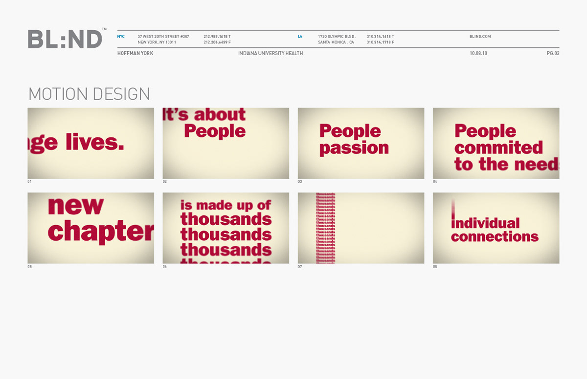
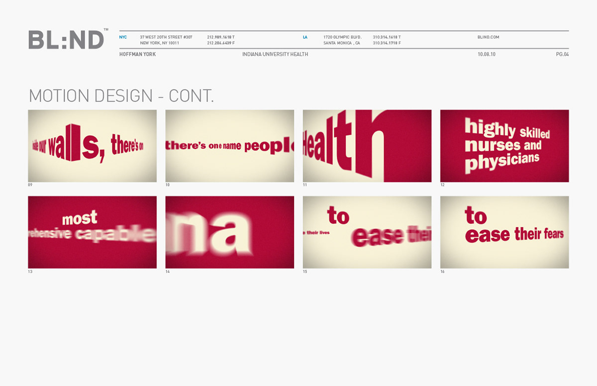
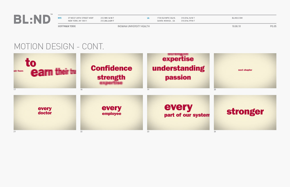
When creating a visually striking piece, where the layout has been reduced to a simple, un-complex form, the narrative arc created by the motion design is the key to a fully engaged viewer. In a simple start, the perceived see-n-say motion, left to right, is on the x axis. The horizon line. Once the viewer begins to become accustomed to seeing the left to right motion, we introduce movement on the vertical axis, providing new possibilities. These possibilities build upon each other until they manifest themselves in a simple depiction of space on a third axis, the z axis. In one point perspective the typography scales back to reveal larger, more complex, layouts. Eventually the one point perspective gives way to two point perspective, creating even more possibilities. The virtual cameras depth of field becomes more apparent. In another big moment, we push into the z-space, towards typography that fills the frame, so that when new typography is introduced the foreground and background colors are flipped. We arrive at a crescendo of movement, space and color, the motion design of the piece reverses its self, towards a calmer setting. In motion designed to focus the viewers attention, the typography in the final scene is in the center of the frame, progressing forward, hitting the final word ‘strength’ with strength its self.
Below are the storyboards style frames for the pitch that win the pitch.